Wednesday, December 31, 2014
Using Data To Predict Data Science in 2015
This is the time of the year when pundits make their 2015 predictions. But to make predictions about Data Science, shouldn't one use data? Here are four charts from Google Trends that show trending performance of various data science technologies. Apache Spark really is overtaking Apache Hadoop.
In this R vs. IPython Notebook chart, we should just gather the trends rather than the absolute magnitudes. "R" is notoriously difficult to Google for, and "R Cran" is just one of the many tricks R users employ to Google for information about R. And, sadly, Google Trends has no way to additively combine search trends together (e.g. "R Cran" OR "R Project"). But, we can still see that IPython Notebook is skyrocketing upward while R is sagging.
This is a little hard to read and requires some explaining. The former name for "Apache Storm" was "Twitter Storm" when Twitter first open-sourced Storm onto GitHub in 2011. But "Twitter Storm" has another common usage, which is a "storm of tweets" such as about a celebrity. I'm guessing about half the searches for "Twitter Storm" are for this latter usage.
The takeaway is that Storm got a two-year head start on Spark Streaming and has been chugging away ever since. Part of the reason is that Spark Streaming, despite the surge in popularity of base Spark, had a lot of catching up to do to Storm in terms of graceful handling of errors and graceful shutdown/restart. A lot of that is addressed in the new HA Spark Streaming features introduced in Spark 1.2.0, released a week ago.
But the other interesting trend is that the academic term "complex event processing" is falling away in favor of the more industry-oriented terms "Storm" and "Spark Streaming".
People forget that "Machine Learning" was quite popular back in the dot-com era. And then it started to fade. That is, until Geoffrey Hinton's invention of deep learning in 2006. That seems to have lifted the popularity of machine learning in general. Well, at least we can say there's a correlation.
The other interesting thing is the very recent (within the past month) uptick in interest in DeepMind. Of course there was a barrage of interest in October when the over-hyped headlines blared "mimics human". But I think people only this past month started getting past the hype and started looking at the actual DeepMind paper which is interesting because it shows how they added state to a neural network, and that that is how they achieved "short term memory".
Saturday, December 13, 2014
Neuromorphic vs. Neural Net
Brain | Artificial Neural Network |
Asynchronous | Global synchronous clock |
Stochastic | Deterministic |
Shaped waves | Scalar values |
Storage and compute synonymous | Storage and compute separate |
Training is a Mystery | Backpropagation |
Adaptive network topology | Fixed network |
Cycles in topology | Cycle-free topology |
The table above lists the differences between a regular artificial neural network (feed-forward non-spiking, to be specific) and a biological brain. An artificial neural network (ANN) is so far in architecture and function from a biological brain that attempts to simulate a brain in silicon go by a different term altogether: neuromorphic
In the table above, if the last row is modified to allow a neural network to have cycles in its network topology, then it becomes known as a recurrent neural network -- still not quite neuromorphic. But by also modifying the first row of the table to remove the global synchronous clock from neural networks, IBM's TrueNorth chip announced August 2014 claims the neuromorphic moniker. (Asynchronous neural networks are also called spiking neural networks (SNN), but TrueNorth combines the properties of both RNNs and SNNs.)
The TrueNorth chip sports one million neurons and 256 million synapses. But you can't buy one. The closest you can come today perhaps is to use an FPAA, a field-programmable analog array, the analog version of an FPGA. But FPAAs haven't scaled nearly as highly as FPGAs. The largest FPAA is the RASP 2.9. The image of its die below comes from a thesis Contributions to Neuromorphic and Reconfigurable Circuits and Systems.
It has only 78 CABs (Computational Analog Block), contrasted to the largest FPGAs which have over one million logic elements. Researchers in 2013 were able to simulate 18 neuromorphic neurons with this RASP 2.9 analog FPAA chip.
The human brain has 100 billion neurons, so it would hypothetically take 100,000 TrueNorth chips to approach equivalence, based on number of neurons alone. Of course, the other factors, in particular the variable wave shape of biological neurons, would like put any TrueNorth simulation of a brain at a great disadvantage. A lot more information can be carried in a wave shape than in a single scalar value.In the diagram at the top of this blog post, the different wave shapes resulted from showing an animal lights spots of different diameters. An artificial neural network, in contrast, would require N number of output neurons to represent N different distinct diameters.
But with an analog FPAA, perhaps neurons that support wave shapes could be simulated, even if for now one may be limited to a dozen or so neurons. But then there is the real mystery: how a biological brain learns, and by extension how to train a neuromorphic system.
Sunday, November 16, 2014
Single GPU-Powered Node 4x Faster Than 50-node Spark Cluster
And BIDMat is just one component of their full BIDMach software stack illustrated below (illustration also from their dissertation).
Intel MKL and GPU/Cuda are of course off-the-shelf libraries. Butterfly mixing is a new 2013 technique by the same two authors that updates a machine learning model "incrementally" by using small subsets of training data and propagating model changes to neighboring subsets. They do not state it explicitly, but these network communication diagrams between the small subsets resemble the butterfly steps in the Fast Fourier Transform algorithm.
Kylix is an even newer (2014) algorithm, again by the same two authors, that further optimizes the butterfly approach by varying the degree of each butterfly node (the number of butterfly nodes each butterfly node must communicate with) in a way that is optimized for real-life power-law data distributions.
Finally, part of their overall approach is what they have coined "rooflining", which is where they compute the theoretical maximum communication and computation bandwidth, say of a GPU, and ensuring that their measured performance comes close to it. In their dissertation, they show they reach 80-90% of CPU/GPU theoretical maximums.
By doing so, the authors have turned GPU hype into reality, and have implemented numerous machine learning algorithms using their BIDMach framework. Now it remains to either make BIDMach available for commercial production use, or to incorporate the concepts into an existing cluster framework like Spark.
Parallel vs. Distributed file systems: Time for RAID on Hadoop?
The long-standing wisdom is that RAID is not beneficial for Hadoop data nodes. This wisdom is traced back to the venerable Hadoop: The Definitive Guide, which cites a 2009 Apache forum posting from Yahoo! engineer Runping Qi reporting experimental results showing JBOD to be faster than RAID-0.
The reasons cited in the Hadoop book are:
- HDFS has redundancy anyway, and
- RAID-0 slows down the entire array to match the speed of the slowest drive in the array
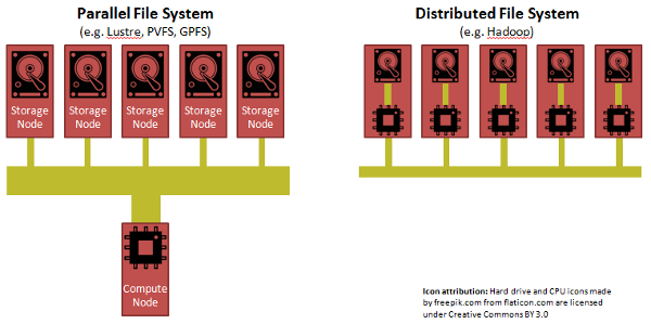
We can look toward "parallel" file systems from the world of High Performance Computing (HPC) for inspiration. The paradigm in HPC is to separate compute from storage, but to have a really fast network, but more importantly to have a "parallel file system". A parallel file system aggregates the bandwidth from many storage nodes to feed a compute node.
While Hadoop was able to achieve its performance through its clever insight of shipping code to data, each CPU in a Hadoop cluster has to suck its data from a single disk through a straw.
The limiting factor for both HPC and Hadoop is the slow transfer rate (1 Gbps) out of a hard drive. HPC addresses this bottleneck by:
- striping data across nodes,
- storing data across nodes in a round-robin fashion, rather than the more random approach that Hadoop takes
- using high-bandwidth links in the cluster (e.g. 40 Gbps Infiniband vs. 1 Gbps or 10 Gbps Ethernet
- using network DMA (Infiniband) instead of a heavy software stack (Ethernet)
There have been a couple chinks in the armor of the "No RAID for HDFS" received wisdom in the past couple of years. The book Pro Apache Hadoop, Second Edition, just published this month, provides one specific exception to the rule:
Some Hadoop systems can drop the replication factor to 2. One example is Hadoop running on the EMC Isilon hardware. The underlying rationale is that the hardware uses RAID 5, which provides a built-in redundancy, enabling a drop in replication factor. Dropping the replication factor has obvious benefits because it enables faster I/O performance (writing 1 replica less).Another is Hortonworks in 2012, which gives credence to the idea of using RAID-0, but at most only pairs of disks at a time.
It seems that we could have the best of both worlds if each node in a Hadoop cluster had parallel I/O across many disks, such as can be provided by RAID-0. As for the concern that RAID-0 is slowed to the speed of the slowest drive, well, the same is true of PVFS.
So should RAID-0 be used in Hadoop data nodes to speed up I/O to the CPU? Probably not, and here's why. CPUs for the past decade have plateaued on clock speed and have instead been adding cores. And there is a recommendation that there be a 1:1 ratio between "spindles to cores". For the purposes of I/O, multiple hard drives joined in RAID-0 would be considered a single spindle. So one could imagine a single 12-core CPU connected to 12 RAID-0 pairs, for a total of 24 drives. But as core count goes up over the upcoming years, and if dual- and quad-CPU motherboards are considered instead, this scenario becomes the exception.
Sunday, November 9, 2014
Data Locality: HPC vs. Hadoop vs. Spark
The big advance Hadoop brought over classic High Performance Computing (HPC) is data locality. Hadoop brings the compute to the data. (HPC compensates by having faster interconnects such as Infiniband and high-bandwidth storage.)
The big advance Spark brought over Hadoop is storing data in each node's RAM instead of each node's disk. Spark's leveraging of data locality is very similar to that of Hadoop's: namely, computation is assigned to occur where the data resides.
Except Spark 1.2 is set to improve that a bit. In a just published paper, AMP Lab contributor Shivaram Venkataraman et al propose assigning the reduce task to the node that happens to have the largest map output, thus minimizing data movement.
This advance is currently slated for Spark 1.2, in Jira ticket SPARK-2774
There are other advances described in the Venkataraman et al paper, namely, when sampling subsets of data such as BlinkDB does, Spark could greedily take whatever data happens to be present on nodes with available compute, and call that the sample. There is no set Spark release for that feature, which the paper calls KMN.
Four Reasons for Immutable HDFS Archive
Two years ago, when I first joined Michael Walker's Data Science & Business Analytics Meetup, the form asked (and still asks) "What important truth do very few people agree with you on?" My answer was "Data should never be deleted". At the time, I had no idea what Data Science was and had barely been introduced to Big Data, but it was a dictum I lived by, much to the consternation of my bosses over the past two decades when it came time to approve purchases of hard drives.
Well, I may have to update my profile, because it seems more and more people are agreeing with me. As I blogged on the January, 2014 Boulder/Denver Big Data Meetup, the discussion format came to a consensus that all ingested data should be kept intact as-is as an immutable data store, and that processed data should be stored in some kind of data warehouse for the actual analytics. I wrote then that it was good to have that pattern, which was in the making for a couple of years, finally codified as a pattern.
It's even more solidified now. The two most common motivations given are:
1. Bugs
You might discover a bug in your processing code, and so you may need to reprocess all the original data with the corrected code.2. New Derived Metric
You might discover you need to track clicks per second rather than just clicks per minute. With the original data still around, it becomes possible to resummarize the raw data.Two Other Reasons
But here are two other reasons, not usually stated when this pattern is presented:3. New Data Enrichment
Suppose in your summarized data you don't store social security number even though it exists in the original data. Then your company just obtained the services of data provider, and you're now able to get household income based on social security number. Now you can append this data as another column in the analytics database.4. Reapply Machine Learning to Bigger Data Set
This is perhaps the most important reason of all, due to the The Unreasonable Effectiveness of Data. As more data becomes available over time from the original data streaming source, machine-learned models can be improved.Semantic Similarity Metrics
Data Science is more than just statistics and machine learning on numbers. A lot of data is "unstructured," which means text (or worse, both text and numbers). While natural language processing has been around for half a century, its importance in the fields of Big Data and Data Science is growing and can no longer be ignored if one is to maintain competitive advantage.
There is a planet full of tools, and herein I describe one grain of sand out of that planet: Semantic Similarity Metrics.
Given a document of text (e.g. a Facebook posting or an e-mail), we can turn it into a set of words or a bag of words. A bag of words is like a set of words, except it also includes the multiplicity. E.g. the miniature document "Now, come now" represented as a set of words would be {"now", "come"} whereas as a bag of words would be
Word | Freq |
---|---|
now | 2 |
come | 1 |
Sets of words and bags of words can alternatively be considered as Boolean vectors and numeric vectors, respectively.
A common need when processing documents is to evaluate their similarity, e.g. to determine if they are duplicates, or to determine how close a sample document might be to a "reference" document (e.g. for automated essay scoring). There are various similarity metrics available, for both Boolean and numeric vectors.
Similarity Metrics for Boolean Vectors
Recall that what we mean by "Boolean Vectors" are really just sets, and it is easier to think about and discuss these as sets rather than as literal Boolean vectors, so we use set notation.
Jaccard Index
The Jaccard Index is the simplest metric:
\[\frac{\left|A \cap B\right|}{\left|A \cup B\right|}\]
Dice-Sørensen
The Dice-Sørensen (aka just Dice or just Sørensen) is similar to the Jaccard.
\[\frac{2\left|A \cap B\right|}{\left|A\right| + \left|B\right|}\]
They both give scores in the range [0,1]. But Dice emphasizes similarity, especially in the cases where one set is larger than the other. However, Dice does not satisfy the triangle inequality and thus is not a true metric in the mathematical sense of the word.
Tversky
Tversky is a generalization of Jaccard and Dice, in that Jaccard and Dice become just special cases of Tversky:
\[\frac{2\left|A \cap B\right|}{\left|A \cap B\right| + \alpha\left|A-B\right| + \beta\left|B-A\right|}\]
We arrive at Jaccard with \(\alpha=\beta=1\) and at Dice with \(\alpha=\beta=0.5\). But by varying \(\alpha\) and \(\beta\) to be different from each other, we can apply Tversky to situations where we wish to treat documents asymmetrically. For example, if instead of documents A and B that are treated equally, we have a reference set R (perhaps some sort of answer key) and a user set U, then by setting \(\alpha\) high we can "punish" the user for missing words that were expected in R. Alternatively, we could set \(\beta\) high to "punish" the scoring for not finding the best R that best matches the user input U.
Similarity Metrics for Numeric Vectors
Instead of having seta A and B, we now consider numeric vectors X and Y, which are frequency counts in our bag of words.
Tanimoto
The Tanimoto metric is the numeric vector generalization of the Jaccard index for Boolean vectors:
\[\frac{X \cdot Y}{\left|X\right|^2 + \left|Y\right|^2 - X \cdot Y}\]
Here, the dot represents the vector dot product.
Cosine
The cosine similarity metric is similar in appearance to Tanimoto:
\[\frac{X \cdot Y}{\left|X\right| \left|Y\right|}\]
The cosine has the appealing property that 0 means a 90 degree separation, or complete orthogonality.
Sunday, June 8, 2014
SSD to the rescue of Peak Hard Drive?
A couple of months ago, I blogged about Peak Hard Drive, that hard drive capacities were leveling off and how this would impact the footprints of data centers in the era of Big Data. Since then, there have been two major announcements about SSDs that indicate they may come to the rescue:
- SanDisk announced 4TB SSD "this year" and 16TB possibly next year. Given that such technologies are typically delayed by one calendar year from their press releases, in the above chart, I've indicated those as becoming available in 2015 and 2016, respectively.
- Japanese researches develoepd a technique to improve SSD performance by up to 300%
It is because of the varying form factors that in my blog post two months ago I adopted the novel "Bytes/Liter" metric, which is a volumetric measure in contrast to the more typical "aerial" metric that applies to spinning platters but not to SSDs. (Actually I changed the metric from log10(KB/Liter) from two months ago to log10(Bytes/Liter) now, reasoning that Bytes is a more fundamental unit than KB, that it eliminates the KB vs. KiB ambiguity, and that it makes the chart above easier to read where you can just pick out the MB, GB, TB, PB by factors of 3 of the exponent of 10.) This volumetric metric can handle everything from the 5.25" full-height hard drives of the 1980's to the varying heights of 2.5" hard drives and allow us to linearly extrapolate on the logarithm chart above.
The direct overlay of the SSD line over the HDD line for the years 1999-2014 came as a complete shock to me. SSDs and HDDs have vastly different performance, form factor, price and performance characterstics. Yet when it comes to this novel metric of volumetric density, they've been identical for the past 15 years!
Now, the announced 4TB 2.5" SSD and presumably also the 16TB SSD are not of the typical notebook hard drive form factor. The typical notebook hard drive is 9.5mm tall, whereas these high-capacity SSDs are 15mm tall. They're intended for data center use, such as in the 2U rack below.
The configuration in the 2U chassis above is typical for 2.5" drives: just 24 drives, because they are all accessible from the front panel. I'm not aware of any high-density solutions for 2.5" drives such as those that exist for 3.5" drives, such as the one below that puts 45 drives into 4U.
In time, there should be some higher density rackmount solutions for 2.5" drives appearing, but for now, today's available solutions don't take full advantage of the compactness of 2.5" SSDs portrayed in the above chart, which measures volumtric density of the drive units themselves and not the chassis in which they reside.
Also not clear is whether the 16TB SSD will be MLC or TLC. The 4TB drive is MLC, which means two bits per cell. If the 16TB drive is TLC, then three bits are stored in each cell (eight different voltage levels detected per cell), which can reduce lifespan by a factor of 3 and for that reason are often not considered for enterprise data center use.
For the moment, we're stuck at the inflection point in the above chart at 2014, wondering which dotted line data centers will be able to take in the future.
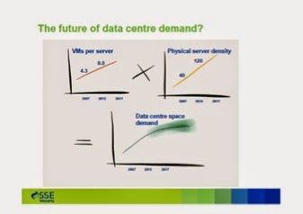
Due to a combination of increased use of VMs in data centers and increased physical server density, projections were that we had reached peak physical square footage for data centers: that no more data centers would have to be built, ever (aside from technology improvements such as cooling and energy efficiency). The slide above is from SSE. My blog on Peak Hard Drive threatened to blow that away and require more data centers to be built due to plateauing hard drive density combined with exploding Big Data use. But now with the two SSD announcements, we might be -- just maybe -- back on track for no more net data center square footage.
Thursday, May 15, 2014
Apache Spark 1.0 almost here. Is it ready with 16 "unresolved blockers" in Jira?
There are currently 16 issues marked as "unresolved blockers" in Jira for Spark, at least one of which is known to produce erroneous data results.
Then there is the state of the REPL, the interactive Spark Shell recently lauded for making Spark accessible to data scientists, as opposed to just hard-core software developers. Because the Spark Shell wraps every user-entered command and class to do its interactive magic, some basic Spark functions fail to operate, such as lookup() and anything requiring equals() on a compound key (i.e. custom Scala class as opposed to just using String or Int for a key) for groupByKey() and other combineByKey() derivatives. It even affects map(), the most fundamental of all functional programming operations.
Even putting the REPL aside and considering just writing full-fledged Scala programs, the native language of Spark, simple combinations such as map() and lookup() throw exceptions.
Don't get me wrong. Spark is a great platform, and is where it should be after two years of open source development. It's the "1.0" badge that I object to. It feels more like a 0.9.2 release.
Sunday, May 11, 2014
GeoSparkGrams: Tiny histograms on map with IPython Notebook and d3.js
Here "spark" is in reference to sparklines, not Apache Spark. Last year I showed tiny histograms, which I coined as SparkGrams, inside an HTML5-based spreadsheet using the Yahoo! YUI3 Javascript library. At the end of the row or column, a tiny histogram inside a single spreadsheet cell showed at a glance the distribution of data within that row or column.
This time, I'm placing SparkGrams on a map of the United States, so I call these GeoSparkGrams. This time I'm using IPython Notebook and d3.js. The notebook also automatically performs the data download from NOAA.
The motivation behind this analysis is to find the best place to live in the U.S. for those sensitive to barometric volatility.
The above notebook requires IPython Notebook 2.0, which was released on April 1, 2014, for its new inline HTML capability and ease of integrating d3.js.
Sunday, May 4, 2014
Matplotlib histogram plot from Numpy histogram data
hist = numpy.histogram(df.ix[df["Gender"]=="Male","Population"],range=(50,90)) pandas.DataFrame({'x':hist[1][1:],'y':hist[0]}).plot(x='x',kind='bar')
Peak Hard Drive
Hard drive capacities are slowing down as shown in the chart below. To account for the shrinking form factors in the earlier part of the history, and to account for exponential growth, I've scaled the vertical axis to be the logarithm of kilobytes (1000 bytes) per liter.
This three year drought on hard drive capacity increases is represented by the plateau between the last two blue dots in the graph, representing 2011 and 2014. The red line extension to 2020 is based on Seagate's prediction that by then they will have 20TB drives using HAMR technology, which uses a combination of laser and magnetism.
However, if the trendline from 2004-2011 had continued, by linear extrapolation on this log scale, hard drives would have been 600TB by 2020.
This is not good news for users of Big Data. Data sizes (and variety and number of sources) are continuing to grow, but hard drive sizes are leveling off. Horizontal scaling is no longer going to be an option; the days of the monolithic RDBMS are numbered. Worse, data center sizes and energy consumption will increase proportional to growth in data size rather than be tempered by advances in hard drive capacities as we had become accustomed to.
We haven't reached an absolute peak in hard drive capacity, so the term "peak hard drive" is an exaggeration in absolute terms, but relative to corporate data set sizes, I'm guessing we did reach peak hard drive a couple of years ago.
QED: Controlling for Confounders
As discussed previously, a controlled randomized experiment from scratch is the "gold standard". The reason is because if there are confounding variables, individual members of the population expressing those variables are randomly distributed and by the law of large numbers those effects cancel each other out.
Most of the time, though, we do not have the budget or time to conduct a unique experiment for each question we want to investigate. Instead, more typically, we're handed a data set and asked to go and find "actionable insights".
This lands us into the realm of quasi-experimental design (QED). In QED, we can't randomly assign members of the population and then apply or not apply "treatments". (Even in data science when analyzing e.g. server logs, the terminology from the hard sciences holds over: what we might call an "input variable" is instead called the "treatment" (as if medicine were being given to a patient) and what we might call an "output variable" is instead called the "outcome" (did the medicine work?).) In QED, stuff has already happened and all we have is the data.
In QED, to overcome the hurdle of non-random assignment, we perform "matching" as shown below. The first step is to segregate the entire population into "treated" and "untreated". In the example below, the question we are trying to answer is whether Elbonians are less likely to buy. So living in Elbonia (perhaps determined by a MaxMind reverse-IP lookup) is the "treatment", not living in Elbonia is "untreated", and whether or not a sale was made is the "outcome". We have two confounding variables, browser type and OS, and in QED that is what we match on.
In this way, we are simulating the question, "all else being equal, does living in Elbonia lead to a less likely sale?"
In this process, typically when a match is made between one member of the treated population and one member of the untreated population, both are thrown out, and then the next attempt at a match is made. Now as you can imagine, there are all sorts of algorithms and approaches for what constitutes match (how close a match is required?), the order in which matches are taken, and how the results are finally analyzed. For further study, take a look at the book Experimental and Quasi-Experimental Designs for Generalized Causal Inference.
Sunday, March 30, 2014
Quick Way to Play With Spark
If you're interested in a quick way to start playing with Apache Spark without having to pay for cloud resources, and without having to go through the trouble of installing Hadoop at home, you can leverage the pre-installed Hadoop VM that Cloudera makes freely available to download. Below are the steps.
- Because the VM is 64-bit, your computer must be configured to run 64-bit VM's. This is usually the default for computers made since 2012, but for computers made between 2006 and 2011, you will probably have to enable it in the BIOS settings.
- Install https://www.virtualbox.org/wiki/Downloads (I use VirtualBox since it's more free than VMWare Player.)
- Download and unzip the 2GB QuickStart VM for VirtualBox from Cloudera.
- Launch VirtualBox and from its drop-down menu select File->Import Appliance
- Click the Start icon to launch the VM.
- From the VM Window's drop-down menu, select Devices->Shared Clipboard->Bidirectional
- From the CentOS drop-down menu, select System->Shutdown->Restart. I have found this to be necessary to get HDFS to start working the first time on this particular VM.
- The VM comes with OpenJDK 1.6, but Spark and Scala need Oracle JDK 1.7, which is also supported by Cloudera 4.4. From within CentOS, launch Firefox and navigate to http://www.oracle.com/technetwork/java/javase/downloads/jdk7-downloads-1880260.html. Click the radio button "Accept License Agreement" and click to download jdk-7u51-linux-x64.rpm (64-bit RPM), opting to "save" rather than "open" it. I.e., save it to ~/Downloads.
- From the CentOS drop-down menu, select Application->System Tools->Terminal and then:
sudo rpm -Uivh ~/Downloads/jdk-7u51-linux-x64.rpm
echo "export JAVA_HOME=/usr/java/latest" >>~/.bashrc
echo "export PATH=\$JAVA_HOME/bin:\$PATH" >>~/.bashrc
source ~/.bashrc
wget http://d3kbcqa49mib13.cloudfront.net/spark-0.9.0-incubating.tgz
tar xzvf spark-0.9.0-incubating.tgz
cd spark-0.9.0-incubating
SPARK_HADOOP_VERSION=2.2.0 sbt/sbt assembly
bin/spark-shell
That sbt assembly command also has the nice side-effect of installing scala and sbt for you, so you can start writing scala code to use Spark instead of just using the Spark Shell.
Saturday, February 8, 2014
Visualization of How Real-time Cardinality Algorithms Work
In a previous blog post, Real-time data science, I textually described an algorithm that can be used, for example, in real-time data streaming applications to estimate the size (cardinality) of a set.
I don't think a description can convey how it works as well as a visualization, so I created an iPython Notebook. Below are the images from that Notebook, but you'll need to click on the Notebook link if you want to see how the images were generated and the detailed description.
As I described in the previous blog post, the motivation behind trying to count items in a data stream might be, for example, doing the equivalent of a SQL COUNT DISTINCT on a website's clickstream to get the number of unique visitors to that website.
Rather than maintaining in memory a list of unique ID's (say, IP addresses), which can consume a lot of memory for a popular website, instead we rely on a hash function and just keep track of the minimum hash value ever seen. That's right, instead of saving n IP addresses (where n might be a million for a very popular website), we just save one data value, the smallest hash value ever seen.
The scatter plot below shows the result. For the top dotted row, 10 random UUID's were hashed to floating point values in the range [0,1). For the middle row, 100 UUID's and for the bottom row, 1000 UUID's. Then we just count the number of leading zeroes of the smallest hash value by using the log10 function. To get the cardinality we just then raise 10 to the power of that number of leading zeros.
And zooming in to the left portion of the plot:
The larger the set, the greater the chance that a hash value will happen to end up closer to zero (left edge of the plot). To get the size of the set, we just count the number of leading zeros, and then raise 10 to the power of that number.
That leaves a lot to chance, of course, so there are ways to reduce the effects of randomness and improve the accuracy. One straightforward way, described in my iPython Notebook linked above, is to split the set into, say, 10 subsets, apply the algorithm to each subset independently, average the results somehow, and multiply that average by 10 to get the cardinality of the whole original set. So in terms of memory utilization, this approach requires the space of 10 floating point numbers instead of just 1.
In my iPython Notebook, I just do a simple straight average, and it does improve the accuracy significantly, but it's still off by a factor of 3 in the particular case I tried. A better way to average is a geometric mean. And best still is the HyperLogLog algorithm which employs something called the harmonic mean.
The bright folks over at Metamarkets, developers of Druid, ran some experiments two years ago and showed that HyperLogLog produces cardinalities that are 98% accurate.
Sunday, January 19, 2014
Corrgram: Multi-variate visualization
Corrgrams, invented and coined by Michael Friendly in his 2002 American Statistician paper are a powerful and rapid way to visualize a dozen or more dimensions simultaneously when in the exploratory phase of multi-variate analysis. (Note that Corrgrams are sometimes erroneously referred to as Correlograms, which are something completely different for time series analysis.)
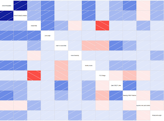
The visualization below is an example generated by the R package corrgram on the Lending Club peer-to-peer lending data that was part of the homework assignment for the Coursera class I took a year ago, Data Analysis.
In the visualization above, brightness (more properly, saturation) of red indicates negative correlation and brightness (saturation) of blue indicates positive correlation, meaning weakly correlated dimensions appear grayish.
The bright red box that jumps out is that FICO score is strongly negatively correlated to interest rates. This highlights two unsurprising points: 1) The higher the FICO score, the lower the interest rate, and 2) FICO score has the strongest influence (by eyeball comparison to all the faded blue squares) on interest rate. We also see that things like loan length, debt-to-income ratio and number of open credit lines increase interest rate, with loan length being the strongest of those secondary influences.
But there's more we can pull out of this visualization. Notice that number of inquiries in the last six months (which means the number of inquiries on one's credit report with the FICO scoring agencies coming from all loan or credit applications, not just those from Lending Club) is a strong influence on Lending Club interest rate. But the correlation between number of inquiries in the last six months and FICO, while a negative correlation as expected, is only a weak negatively correlation from its very pale rose color. That suggests that perhaps Lending Club lenders more strongly dislike (and thus penalize) borrowers with a lot of credit inquiries than do conventional lenders. It suggests perhaps that Lending Club lenders dislike (disproportionately so relative to conventional lenders, or at least the FICO scoring system itself) being the "lender of last resort" and assign a higher risk and thus higher interest rate to such situations. This quilt of colors can't tell us all this for certain -- neither numerically in statistics nor certainly in terms of causality -- but it quickly points us onto paths of investigation that could lead to verifying such unanticipated insights.
Now, the 12 dimensions in the above visualization push the envelope of what is practical with corrgrams, whereas data sets in real life often have hundreds of dimensions. In multi-variate analysis, one way to reduce the number of dimensions is to perform a random forest followed by a variable importance plot. While random forest has a reputation of being opaque, one can still easily obtain the list of variables chosen as top nodes most often. From that list, simply pick the first dozen or so and plug them into a corrgram to visualize the interactions amongst the most important deciding variables. This can be improved further through iteration: if two variables, such as, hypothetically, "Average bank balance for past 3 months" and "Average bank balance for past 6 months" are shown to be strongly correlated, you can discard one of those in the corrgram and use that valuable corrgram slot for a different variable.
Saturday, January 11, 2014
Science Data Science
We commonly hear about "data science" in the context of mining marketing or business data, especially "Big Data", but of course scientists have been practicing statistics for centuries.
But recall data science is more than just statistics, from Drew Conway's famous Venn Diagram:
For scientists to move out of "traditional research" and into data science, they need to add computer-based skills such as machine learning and big data.
Just data management has long been a problem in the scientific realm. We learned last month that 80% of scientific data from science conducted over the past 20 years is already lost due to poor data retention policies. In recognition of that, U.S. government funding grants now require a data retention plan to be included in funding proposals. And just two days ago, IEEE Spectrum posted a blog article on Gordon Moore's new law, that "big data will lead to big science," and his philanthropic efforts to support that.
But why is scientific data retention so poor? Having worked in the scientific software development field for half my career, I can speculate on several reasons:
- Scientific data is not amenable to conventional (e.g. relational) databases. Scientific data sets are typically array-based (2D, 3D, 4D, and higher), where the array indices rather than relational metadata describe the data. This is a fancy way of saying a bunch of flat unannotated binary files, but there are reasons scientists use such files: they are compact relative to, say, XML and JSON; they are easy to write software to read and write; and they are not tied to a particular software vendor. With their ease of use, though, comes ease of deletion. Corporate and institutional cultures pay no heed when files get deleted, but try and delete a database and suddenly the resistance increases dramatically. Along with the convenience of binary files preferred by scientists comes the disrespect of files.
- Until this focus over the past 3-5 years on data retention, funding proposals never included funding for prolonged data retention. Data retention is expensive. Data formats change, from 8" floppies, to 5.25" floppies, to Bernoulli drives, to 3.5" floppies, to Zip drives, to Jaz drives, to QIC tapes, to CD-ROM, to DVD-R, to LTO tapes, to USB drives, not to mention data on raw hard drives: MFM, RLL, SCSI, Ultra SCSI, IDE, SATA, SAS. It takes both labor and capital investment to continually propagate data from one format to another. Not only must data be format shifted, even within a single format it must be refreshed to guard against physical or magenetic decay. Properly maintained data also involves maintaining multiple backups, including at off-site locations.
- Compounding the issue is that scientific data would retain its value even more than business data. Longitudinal studies of humans or civil engineering edifices can leverage data spanning a century or more. New scientific studies frequently make use of old data sets, applying new techniques or new insights, when such data is available (or, perhaps if it were available).
- Scientists are not experts in computers, let alone IT "best practices". Scientists typically know enough about computers to get by, but have not yet generally added that third bubble from the Venn diagram.
- Scientists often have to rely on proprietary and commercial software and systems for data collection. These systems are specialized, and have no open source counterparts due to the lack of economic forces that propel open source software in the realm of business software. Scientific software even often comes tethered to dongles, or works only on proprietary operating systems no longer available (such as MS-DOS). I have even blogged and presented on an alternative to all this, XML/XSL/HTML5 for reports instead of PDF, where I suggest visualization and presentation software programs be encoded in the form of open-source Javascript instead of closed-source proprietary and commercial binaries, but I know of no uptake outside of my singular implementation of the idea.
Data retention is the critical first step to expanding data science in the scientific realm. Without data retention, there can be no statistics and machine learning over data sets that include data from the past or data from other researchers. I can imagine scientists universally adopting tools like R, iPython Notebook, and Weka like a fish to water, but without data, there is no water.
Wednesday, January 1, 2014
Hypothesis formation
The ideal hypothesis:
- Has basis in a reasonable engineering, physical, or economic, etc. model.
- Is as simple as can be in terms of number of variables. I.e. Occam's Razor has been applied.
- Either has been vetted against a number of other hypotheses and selected as the most reasonable, or will be tested along with other reasonable hypotheses.
- Will be tested in the gold standard, the randomized controlled experiment.
- Is actionable.
Basis in a Model
As discussed in my causality blog entry, the only way to assign causality is to develop a rational model about how things really work, not just from the output of some multivariate correlation done in R. The best hypotheses are rooted in causation, though it is of course possible to hypothesize anything conjecture at all, including from statistical correlations discovered during data exploration. Discovery from data as a source of hypothesis is better than pulling from thin air, but hypothesizing from a model is best of all. Hypothesizing from data is called induction and hypothesizing from a model is called deduction.Simplicity
The fewer the variables, the stronger the hypothesis and the more robust it is, by which it is meant the more likely it will hold up to a variety of conditions. E.g., suppose we induce a hypothesis from data exploration that teenage girls that use Twitter like Justin Beiber. A stronger hypothesis (if it turns out to be true) would be to get rid of the Twitter condition, not only because it broadens the potential market for Justin Beiber products, but also because it is more resilient in varied circumstances, such as perhaps a time when (assuming some sort of unlikely calamity befalls Twitter) Twitter is no longer popular and something takes its place.Vetted Against Competing Hypotheses
When forming a hypothesis, it is important to brainstorm as many different plausable hypotheses as possible, from a variety of sources:- As with conventional brainstorming, ask fellow team members and associates for their creative hypotheses.
- Formulate as complete a model as possible, and from that model identify explanations. E.g., when modeling a consumer:
- What is the consumer's budget?
- What is the pay schedule of the consumer?
- Are there upcoming holidays that would either enhance purchases (in anticipation) or hinder them (due to store or bank closures)?
- What products complement the products the consumer already owns?
- What products would enhance the social standing of the consumer?
- Does the consumer carry credit cards that are accepted?
- Is the consumer a student?
- Identify leading hypotheses and test them. This is easier said than done. "Identifying" is a nice way of saying "hunch," because the alternative, "test," is very expensive if done by the gold standard, the controlled randomized experiment.
Controlled Randomized Experiment
Controlled randomized experiments are the gold standard, but they are expensive and time consuming. It is much more convenient and quicker to find and test correlations in existing data sets, but such correlations are fraught with problems: population not random throughout independent variables of the new hypothesis, limited data for train vs. test that effectively lead to test data becoming training data, experimental conditions being different, etc.But from a practical standpoint, "quasi-experiments" (experiments from an existing data set) are the general rule encountered in practice and "experiments" are, realistically, the exception. Compensating for the shortcomings of quasi-experiments will be the subject of a future article.
Actionable
You can have the most interesting, perhaps even insightful, hypothesis, but if there is no reasonable course of action to take once it is proven, it's a waste of time to prove it.Conclusion
Good hypothesis formation:- Avoids wasting time testing bad hypotheses
- Saves time that can be redirected toward testing the best hypotheses, including testing hypothesis adjacent to the leading hypotheses to avoid spurious correlations
- Results in more resilient, more actionable insights.