Sunday, January 19, 2014

Corrgram: Multi-variate visualization

Corrgrams, invented and coined by Michael Friendly in his 2002 American Statistician paper are a powerful and rapid way to visualize a dozen or more dimensions simultaneously when in the exploratory phase of multi-variate analysis. (Note that Corrgrams are sometimes erroneously referred to as Correlograms, which are something completely different for time series analysis.)

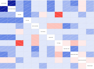
The visualization below is an example generated by the R package corrgram on the Lending Club peer-to-peer lending data that was part of the homework assignment for the Coursera class I took a year ago, Data Analysis.

In the visualization above, brightness (more properly, saturation) of red indicates negative correlation and brightness (saturation) of blue indicates positive correlation, meaning weakly correlated dimensions appear grayish.

The bright red box that jumps out is that FICO score is strongly negatively correlated to interest rates. This highlights two unsurprising points: 1) The higher the FICO score, the lower the interest rate, and 2) FICO score has the strongest influence (by eyeball comparison to all the faded blue squares) on interest rate. We also see that things like loan length, debt-to-income ratio and number of open credit lines increase interest rate, with loan length being the strongest of those secondary influences.

But there's more we can pull out of this visualization. Notice that number of inquiries in the last six months (which means the number of inquiries on one's credit report with the FICO scoring agencies coming from all loan or credit applications, not just those from Lending Club) is a strong influence on Lending Club interest rate. But the correlation between number of inquiries in the last six months and FICO, while a negative correlation as expected, is only a weak negatively correlation from its very pale rose color. That suggests that perhaps Lending Club lenders more strongly dislike (and thus penalize) borrowers with a lot of credit inquiries than do conventional lenders. It suggests perhaps that Lending Club lenders dislike (disproportionately so relative to conventional lenders, or at least the FICO scoring system itself) being the "lender of last resort" and assign a higher risk and thus higher interest rate to such situations. This quilt of colors can't tell us all this for certain -- neither numerically in statistics nor certainly in terms of causality -- but it quickly points us onto paths of investigation that could lead to verifying such unanticipated insights.

Now, the 12 dimensions in the above visualization push the envelope of what is practical with corrgrams, whereas data sets in real life often have hundreds of dimensions. In multi-variate analysis, one way to reduce the number of dimensions is to perform a random forest followed by a variable importance plot. While random forest has a reputation of being opaque, one can still easily obtain the list of variables chosen as top nodes most often. From that list, simply pick the first dozen or so and plug them into a corrgram to visualize the interactions amongst the most important deciding variables. This can be improved further through iteration: if two variables, such as, hypothetically, "Average bank balance for past 3 months" and "Average bank balance for past 6 months" are shown to be strongly correlated, you can discard one of those in the corrgram and use that valuable corrgram slot for a different variable.
Saturday, January 11, 2014

Science Data Science

We commonly hear about "data science" in the context of mining marketing or business data, especially "Big Data", but of course scientists have been practicing statistics for centuries.

Timeline of Statistics.

But recall data science is more than just statistics, from Drew Conway's famous Venn Diagram:

Data Science Venn Diagram

For scientists to move out of "traditional research" and into data science, they need to add computer-based skills such as machine learning and big data.

Just data management has long been a problem in the scientific realm. We learned last month that 80% of scientific data from science conducted over the past 20 years is already lost due to poor data retention policies. In recognition of that, U.S. government funding grants now require a data retention plan to be included in funding proposals. And just two days ago, IEEE Spectrum posted a blog article on Gordon Moore's new law, that "big data will lead to big science," and his philanthropic efforts to support that.

But why is scientific data retention so poor? Having worked in the scientific software development field for half my career, I can speculate on several reasons:

  • Scientific data is not amenable to conventional (e.g. relational) databases. Scientific data sets are typically array-based (2D, 3D, 4D, and higher), where the array indices rather than relational metadata describe the data. This is a fancy way of saying a bunch of flat unannotated binary files, but there are reasons scientists use such files: they are compact relative to, say, XML and JSON; they are easy to write software to read and write; and they are not tied to a particular software vendor. With their ease of use, though, comes ease of deletion. Corporate and institutional cultures pay no heed when files get deleted, but try and delete a database and suddenly the resistance increases dramatically. Along with the convenience of binary files preferred by scientists comes the disrespect of files.
  • Until this focus over the past 3-5 years on data retention, funding proposals never included funding for prolonged data retention. Data retention is expensive. Data formats change, from 8" floppies, to 5.25" floppies, to Bernoulli drives, to 3.5" floppies, to Zip drives, to Jaz drives, to QIC tapes, to CD-ROM, to DVD-R, to LTO tapes, to USB drives, not to mention data on raw hard drives: MFM, RLL, SCSI, Ultra SCSI, IDE, SATA, SAS. It takes both labor and capital investment to continually propagate data from one format to another. Not only must data be format shifted, even within a single format it must be refreshed to guard against physical or magenetic decay. Properly maintained data also involves maintaining multiple backups, including at off-site locations.
  • Compounding the issue is that scientific data would retain its value even more than business data. Longitudinal studies of humans or civil engineering edifices can leverage data spanning a century or more. New scientific studies frequently make use of old data sets, applying new techniques or new insights, when such data is available (or, perhaps if it were available).
  • Scientists are not experts in computers, let alone IT "best practices". Scientists typically know enough about computers to get by, but have not yet generally added that third bubble from the Venn diagram.
  • Scientists often have to rely on proprietary and commercial software and systems for data collection. These systems are specialized, and have no open source counterparts due to the lack of economic forces that propel open source software in the realm of business software. Scientific software even often comes tethered to dongles, or works only on proprietary operating systems no longer available (such as MS-DOS). I have even blogged and presented on an alternative to all this, XML/XSL/HTML5 for reports instead of PDF, where I suggest visualization and presentation software programs be encoded in the form of open-source Javascript instead of closed-source proprietary and commercial binaries, but I know of no uptake outside of my singular implementation of the idea.

Data retention is the critical first step to expanding data science in the scientific realm. Without data retention, there can be no statistics and machine learning over data sets that include data from the past or data from other researchers. I can imagine scientists universally adopting tools like R, iPython Notebook, and Weka like a fish to water, but without data, there is no water.

Wednesday, January 1, 2014

Hypothesis formation

Somewhat of a sequel to my earlier blog post on causality, where do hypotheses come from?
The ideal hypothesis:
  • Has basis in a reasonable engineering, physical, or economic, etc. model.
  • Is as simple as can be in terms of number of variables. I.e. Occam's Razor has been applied.
  • Either has been vetted against a number of other hypotheses and selected as the most reasonable, or will be tested along with other reasonable hypotheses.
  • Will be tested in the gold standard, the randomized controlled experiment.
  • Is actionable.
Real life is not ideal, so below I discuss compromises and trade-offs involved in hypothesis formation.

Basis in a Model

As discussed in my causality blog entry, the only way to assign causality is to develop a rational model about how things really work, not just from the output of some multivariate correlation done in R. The best hypotheses are rooted in causation, though it is of course possible to hypothesize anything conjecture at all, including from statistical correlations discovered during data exploration. Discovery from data as a source of hypothesis is better than pulling from thin air, but hypothesizing from a model is best of all. Hypothesizing from data is called induction and hypothesizing from a model is called deduction.

Simplicity

The fewer the variables, the stronger the hypothesis and the more robust it is, by which it is meant the more likely it will hold up to a variety of conditions. E.g., suppose we induce a hypothesis from data exploration that teenage girls that use Twitter like Justin Beiber. A stronger hypothesis (if it turns out to be true) would be to get rid of the Twitter condition, not only because it broadens the potential market for Justin Beiber products, but also because it is more resilient in varied circumstances, such as perhaps a time when (assuming some sort of unlikely calamity befalls Twitter) Twitter is no longer popular and something takes its place.

Vetted Against Competing Hypotheses

When forming a hypothesis, it is important to brainstorm as many different plausable hypotheses as possible, from a variety of sources:
  • As with conventional brainstorming, ask fellow team members and associates for their creative hypotheses.
  • Formulate as complete a model as possible, and from that model identify explanations. E.g., when modeling a consumer:
    • What is the consumer's budget?
    • What is the pay schedule of the consumer?
    • Are there upcoming holidays that would either enhance purchases (in anticipation) or hinder them (due to store or bank closures)?
    • What products complement the products the consumer already owns?
    • What products would enhance the social standing of the consumer?
    • Does the consumer carry credit cards that are accepted?
    • Is the consumer a student?
    The model doesn't have to be complete and fully accurate -- just enough to spark brainstorming. I.e., it's not necessary to create a Bayesian Belief Network or Root-Cause Analysis Fishbone just to hypothesize.
  • Identify leading hypotheses and test them. This is easier said than done. "Identifying" is a nice way of saying "hunch," because the alternative, "test," is very expensive if done by the gold standard, the controlled randomized experiment.
And by so "identifying a leading hypothesis," one becomes subject to the cherry-picking I discussed in the Panel on "Resolved: Traditional Statistics is Dead". It's nice to pick the best hypothesis from a bunch, but to ensure you don't stumble into a spurious correlation, it's ideally necessary to test all similar hypotheses. In the example proctored in the forum, there turned out to be a correlation between Superbowls and presidential elections. Aside from the obvious modeling deficiencies, my response was whether correlations between MLB penants or NHL cups and presidential elections had also been tested. However, the alternative to picking good hypotheses is to leave it to chance, which is not productive. So pick good hypotheses, but beware of spurious correlations, especially if your hypothesis came from induction from the data rather than deduction from a model.

Controlled Randomized Experiment

Controlled randomized experiments are the gold standard, but they are expensive and time consuming. It is much more convenient and quicker to find and test correlations in existing data sets, but such correlations are fraught with problems: population not random throughout independent variables of the new hypothesis, limited data for train vs. test that effectively lead to test data becoming training data, experimental conditions being different, etc.
But from a practical standpoint, "quasi-experiments" (experiments from an existing data set) are the general rule encountered in practice and "experiments" are, realistically, the exception. Compensating for the shortcomings of quasi-experiments will be the subject of a future article.

Actionable

You can have the most interesting, perhaps even insightful, hypothesis, but if there is no reasonable course of action to take once it is proven, it's a waste of time to prove it.

Conclusion

Good hypothesis formation:
  • Avoids wasting time testing bad hypotheses
  • Saves time that can be redirected toward testing the best hypotheses, including testing hypothesis adjacent to the leading hypotheses to avoid spurious correlations
  • Results in more resilient, more actionable insights.