Showing posts with label Visualization. Show all posts

Sunday, May 11, 2014

GeoSparkGrams: Tiny histograms on map with IPython Notebook and d3.js


Daily variation of barometric pressure (maximum minus minimum for each day) in inches, for the past 12 months. For each of the hand-picked major cities, the 365 daily ranges for that city are histogrammed.

Here "spark" is in reference to sparklines, not Apache Spark. Last year I showed tiny histograms, which I coined as SparkGrams, inside an HTML5-based spreadsheet using the Yahoo! YUI3 Javascript library. At the end of the row or column, a tiny histogram inside a single spreadsheet cell showed at a glance the distribution of data within that row or column.

This time, I'm placing SparkGrams on a map of the United States, so I call these GeoSparkGrams. This time I'm using IPython Notebook and d3.js. The notebook also automatically performs the data download from NOAA.

The motivation behind this analysis is to find the best place to live in the U.S. for those sensitive to barometric volatility.

The above notebook requires IPython Notebook 2.0, which was released on April 1, 2014, for its new inline HTML capability and ease of integrating d3.js.

Sunday, January 19, 2014

Corrgram: Multi-variate visualization

Corrgrams, invented and coined by Michael Friendly in his 2002 American Statistician paper are a powerful and rapid way to visualize a dozen or more dimensions simultaneously when in the exploratory phase of multi-variate analysis. (Note that Corrgrams are sometimes erroneously referred to as Correlograms, which are something completely different for time series analysis.)

The visualization below is an example generated by the R package corrgram on the Lending Club peer-to-peer lending data that was part of the homework assignment for the Coursera class I took a year ago, Data Analysis.

In the visualization above, brightness (more properly, saturation) of red indicates negative correlation and brightness (saturation) of blue indicates positive correlation, meaning weakly correlated dimensions appear grayish.

The bright red box that jumps out is that FICO score is strongly negatively correlated to interest rates. This highlights two unsurprising points: 1) The higher the FICO score, the lower the interest rate, and 2) FICO score has the strongest influence (by eyeball comparison to all the faded blue squares) on interest rate. We also see that things like loan length, debt-to-income ratio and number of open credit lines increase interest rate, with loan length being the strongest of those secondary influences.

But there's more we can pull out of this visualization. Notice that number of inquiries in the last six months (which means the number of inquiries on one's credit report with the FICO scoring agencies coming from all loan or credit applications, not just those from Lending Club) is a strong influence on Lending Club interest rate. But the correlation between number of inquiries in the last six months and FICO, while a negative correlation as expected, is only a weak negatively correlation from its very pale rose color. That suggests that perhaps Lending Club lenders more strongly dislike (and thus penalize) borrowers with a lot of credit inquiries than do conventional lenders. It suggests perhaps that Lending Club lenders dislike (disproportionately so relative to conventional lenders, or at least the FICO scoring system itself) being the "lender of last resort" and assign a higher risk and thus higher interest rate to such situations. This quilt of colors can't tell us all this for certain -- neither numerically in statistics nor certainly in terms of causality -- but it quickly points us onto paths of investigation that could lead to verifying such unanticipated insights.

Now, the 12 dimensions in the above visualization push the envelope of what is practical with corrgrams, whereas data sets in real life often have hundreds of dimensions. In multi-variate analysis, one way to reduce the number of dimensions is to perform a random forest followed by a variable importance plot. While random forest has a reputation of being opaque, one can still easily obtain the list of variables chosen as top nodes most often. From that list, simply pick the first dozen or so and plug them into a corrgram to visualize the interactions amongst the most important deciding variables. This can be improved further through iteration: if two variables, such as, hypothetically, "Average bank balance for past 3 months" and "Average bank balance for past 6 months" are shown to be strongly correlated, you can discard one of those in the corrgram and use that valuable corrgram slot for a different variable.

Wednesday, August 21, 2013

Unsquish Pandas/Matplotlib bar chart x labels

For a line plot, Matplotlib intelligently chooses x axis ticks and labels. But for bar charts, it blindly tries to print one for each bar, regardless of how many bars there are or how small they are. This can result in labels overprinting each other.

To see an example and the corresponding solution, see my IPython Notebook Solving x axis overprinting on Pandas/Matplotlib bar charts on GitHub.

Before:

After:

Monday, July 29, 2013

Choropleth in D3.js and Pandas (IPython Notebook)

UPDATE 2014-06-08: This post is outdated as it is for IPython Notebook 1.0. Please see GeoSparkGrams: Tiny histograms on map with IPython Notebook and d3.js for IPython Notebook 2.0.


A lot of people have done a mash-up of D3 with IPython Notebook. Some efforts created a floating overlay over the Notebook rather than creating the output in the standard Notebook inline format. More recent efforts have utilized the Notebook's publish_html() to generate the output inline. One of the more advanced such efforts, ipyD3, however, works only on Windows. I've forked his gist and modified the couple of lines to make it Mac compatible. There is a small chance it's still Windows-compatible with my changes, but I haven't tested it. I'm almost certain the changes allow it to work on Linux too, but again, I've only tested it on a Mac.
I posted a notebook that generates the Choropleth below.
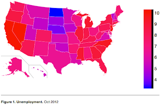
Besides demonstrating how to use D3 from IPython Notebook, it also demonstrates use of geographical maps in D3, itself not straightforward (or at least not built-in).
To transfer a Pandas Dataframe to ipyD3, I convert it to 2D Numpy array. In this particular example, I could have instead just converted the Dataframe to a dict and then passed a dict to ipyD3, since that is one of the data types it is able to marshal to the Javascript, but I wanted to show a more general approach of passing any Dataframe to ipyD3. Numpy arrays preserve column order, unlike quick examples I found on the web of converting Dataframes to JSON (which use non-order preserving dicts as an intermediate form), but at the expense of stripping out the column names. If your custom D3.js code needs column names, you'll have to pass that in as an additional Javascript variable.
The map shape data comes from Wikipedia, which has each state conveniently identified by its two-letter postal code for the SVG id and by the SVG class name of "state". The unemployment data is just something I found on GitHub.
Before executing this example, you'll need to download the ipyD3.py from my gist and put it in the same directory as where you launch IPython Notebook from.
Printing is a challenge. The "long paper" PDF technique below works, but only on the first inline ipyD3. The publish_html technique employed by ipyD3 is not foolproof; full-fledged D3.js support is not expected in IPython Notebook until version 2.0 (and version 1.0 isn't even out yet).
UPDATE 2013-07-30: Forgot to mention that you also need to install and download PhantomJS.
UPDATE 2013-08-06: I discovered it's possible to convert a Pandas Dataframe to a Numpy array directly with just array() and dropping the .to_records().tolist(). Doing so drops the first column, the row indexes, but those are not usually needed. If you modify my example to omit the .to_records().tolist(), you'll also need to reduce each of the hard-coded Javascript column indexes by 1.
UPDATE 2014-06-08: This post is outdated as it is for IPython Notebook 1.0. Please see GeoSparkGrams: Tiny histograms on map with IPython Notebook and d3.js for IPython Notebook 2.0.

Tuesday, June 18, 2013

Histogram thumbnails inside YUI3 data grids

Sparklines are tiny graphs added inline to data tables or lists. Sparklines have no units or gridlines; the purpose is just to quickly convey the shape of the data, which is usually presented adjacent.

A powerful variant on sparklines are sparkline histograms, or "sparkgrams" as I like to call them. Sparkgrams can quickly and compactly convey data distributions: outliers, right/left skew, normal vs. uniform distribution, etc. Because they are small, they can be included right inside a data table for every column or row. Such a presentation is useful either for completely known data when embarking upon data analysis, or for newly received data of a known data type in, for example, a manufacturing quality control scenario.

Below is an example of how it might look. The first column demonstrates an outlier, while the second column conveys a normal distribution.

Below is the YUI3 code to render the above.

<!DOCTYPE html>
<head>
 <script src="yui/build/yui/yui-min.js"></script>
 <script>
  YUI().use('datatable', 'charts', function(Y) {
   var fmt = function(o) {
    if (o.value.substring && o.value.substring(0,5) === "chart")
     o.cell.set("innerHTML", "<div id='" + o.value +
                "' style='width:75px;height:75px'></div>");
    else
     o.cell.set("text", o.value);
    return false;
   }

   var table = new Y.DataTable({columns: [{"key":"Indoors",  "nodeFormatter":fmt},
                                          {"key":"Outdoors", "nodeFormatter":fmt}],
                                data: [{"Indoors": 73.3, "Outdoors": 86.2},
                                       {"Indoors": 73.5, "Outdoors": 86.5},
                                       {"Indoors": 73.5, "Outdoors": 86.6},
                                       {"Indoors": 50.7, "Outdoors": 86.8},
                                       {"Indoors": "chart0", "Outdoors": "chart1"}],
                                render: "#table"});

   for (col = 0; col < table._displayColumns.length; col++) {
    var a = Array();
    for (row = 0; row < table.get("data").size()-1; row++)
     a.push(table.getCell([row,col]).get("text"));
    var NUM_BINS = 3;
    var amin = Math.min.apply(Math, a);
    var binwidth = 1.001 * (Math.max.apply(Math, a)-amin) / NUM_BINS;
    var data=Array();
    for (i=0; i<NUM_BINS; i++)
     data.push({category:amin+i*binwidth, values:0});
    for (i=0; i<a.length; i++)
     data[Math.floor((a[i]-amin)/binwidth)].values++;
    new Y.Chart({dataProvider: data, type:"column",
                 axes: {values: {position:"none"}, category: {position:"none"}},
                 render:"#chart"+col});
   }
  });
 </script>
</head>
<body>
 <div id="table" class="yui3-skin-sam"></div>
</body>
</html>

Friday, July 4, 2008

Looking for business 3D? Use WPF

The world of 3D on Windows for business or scientific purposes has been in flux for many years. DirectX was intended for games and besides was for unmanaged code while Microsoft has been pushing for development to be managed code (and rumors circulate that the version of Windows after Vista won't even run unmanaged code natively). Then there was Managed DirectX (MDX), version 2.0 of which was suddenly abandoned just as it was about to get out of beta. Then Microsoft came out with XNA Game Development Studio at the end of 2007. This had three problems. First, it was for Visual Studio 2005 instead of Visual Studio 2008. OK, maybe we can live with that. Second, it was geared toward games, with the framework expecting the application to always and continuously compute the next frame. Well, I guess we can work around that. Third, it wasn't compatible with WinForms (or any other managed platform for desktops). It was on their list of features to add, but they ran behind schedule and nixed it. Big problem.

The correct and best way today to develop 3D applications for business and scientific domains on Windows is to use WPF (Windows Presentation Foundation), which is part of .NET 3.x. WPF exploits 3D acceleration hardware like DirectX and is fully accessible to C# desktop applications. And it's compatible with Visual Studio 2008 -- in fact WPF seems to be the primary reason Visual Studio 2008 was even built.

That's a screenshot of a WPF application I'm working on. The cylinder and metal cans were mathematically computed on the fly in C#, because they're such simple shapes. The hammer and chisel were designed in Blender 3D and exported to XAML. Using standard Windows mouse interaction code, the cylinder, cans, and hammer can be dragged around.